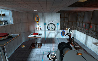
I constructed different pieces in a modular way that would stay true to my designs and the art style i had envisioned for the game. I looked at games like portal to see how the artists had handled a Research and Development lab setting as well as the color palette they used, i saw that they had muted colors and the pieces were pretty simple but put together everything worked well to create a nice lab atmosphere. Since our mechs are essentially prototypes being tested in labs by the government i figured portal's art would be helpful. So i had my setting and color palette but i still had to figure out the 2D art style i wanted to go with for this i turned to one of my favorite game series, Metroid. Metroid Fusion to be exact is a gameboy advanced game but the art style is so well done i was really inspired by the way they use values to show volume as well as surface detail so i used it as a reference to make my panels and other assets for the environment.


During my disciplinary review with Joan Patel i was told that the art was one of the most consistent that she has seen so far out of the people that have come to her.
Thats always good to hear. I have a couple more pieces to make for the environment and then i will move on to the weapons and the mech. I am really excited that things are taking shape!

.gif)


No comments:
Post a Comment