Tuesday, February 26, 2013

Banisher

This week i concentrated on Banisher the spiritual equivalent to DC's Batman and Marvel's Punisher. His back story bears a striking resemblance to Batman's origin except for the fact that Banisher has been pushed too far and doesn't mind getting his hands dirty, and by dirty i mean bloody which is how we incorporated some of the Punisher's identity into the character.
Right off the bat i knew that i wanted to have a character that had a tactical look to him yet he still wore armor fit to fight super heroes, however we didn't want it to look like Major Marvelou's hard surface armor. I decided to give him a vest made out of kevlar plating along the line of Batman's armor in the Dark Knight series but i made it less apparent by giving him a trench coat to go over it this would replace the cape and hide some of his armor so he can catch his enemies off guard.
I looked at a lot of the bat family for references but I didn't just stop with Batman. I looked at the new generation of Robin, Night Wing, and Punisher iterations as well as other video game characters such as Chris Redfield whom has a very tactical look to him. I also referenced real life tactical vests, shoulder pads and trench coats to figure out how they would fit together.


After all of the research i felt like i was ready to start the iteration process. I took the tactical look of the vest and made an iteration depicting a character that was more of vigilante soldier than a super hero. The next iteration was on the opposite spectrum, it looked more like a super hero but the color choice made him look more metallic than kevlar and a lot of people got a Robocop meets Batman feel out of it, for the first two characters i made a version with a trench coat and one without. I eventually tried to find a middle ground between the two for the third concept.
Finally we decided that the gauntlets were not working with the tactical look and there was something off about the boots. For the next iteration I unified the kevlar vest, gave him full pants with knee pads and gave him padded gloves instead of metal gauntlets, i also added some detail on the trench coat to make it more interesting.

Monday, February 18, 2013

A Titan Approaches

Lots to report this week. Th Hulk character (Titan) hopefully is coming along quite well. The concepts were received very favorably leaning towards the middle red titan and the far right titan. From there i took all of the criticism and elements that people liked and put them together. the result was this:
From here we decided that we liked the one on the right the most and that maybe the spikes could be toned down if there were going to be any on the shoulders for aesthetic as well as technical reasons. The over all favorite was the right one because people liked the black tattoos better- gotta give people what they want.
One thing that came up during our discussions was to try out some different color choices, maybe going with a less saturated color palette or playing around with the tattoo.
I did some iterations with different colors, and i also changed the spikes from the shoulders to the back which we thought would work better.
 I think that all of the color choices turned out really well i specially liked the light blue one and the green but over all i really want to stick with a warmer color palette. And since this character is supposed to be our "Hulk character" i want to keep him red to keep the satire that we have with our other characters going.
Lastly i did play around with the tattoo i decided to darken the red of the body and make the tattoo with a slight glow. I believe this is the most successful iteration by far and we will see how well it is received by the class.


Tuesday, February 12, 2013

With Green Light comes a new Character

Last week we had our green light presentation and im glad to announce that we passed with flying colors. Everything from the technical side and effects to the art style and characters is coming along and the game looks insanely better than it did last semester, we are all very excited with how everything is shaping up. Now for updates in the concept department.

Light-Speed Lass:
After a couple of weeks of iteration her concepts are finally done. After much back and forth with Tristan we finally worked out the details about her visor as well as the details that should show in the design of the helmet. We also worked out the back of her armor which will feature similar lights as her belt design as well as the helmet. We are thinking that it would be really interesting to see the lights leave a trail when she uses her super speed power, as well as an animation of her helmet visor coming down and protecting her face for the high speed attack. Among other ideas we are thinking that for her Pow move she would slow down time for a bit with the idea that she would be moving super fast.

Next up is our new character which is the representation of the HULK style character. I am a huge fan of the Hulk so i am really excited to start the concept process for him. First off one of the things that makes the hulk such a great character is the amount of sheer rage and power that he represents, this is something i wanted to portray in my design as well. One thing i know for sure is that the character can't be green as that would be a very blatant copy since hulk is essentially a very angry green man with huge muscles, another thing i also know is that we want to keep the essence of the Hulk so that means minimal clothing and a lot of muscle definition. For this i looked at references from Hulk, Red Hulk, Doomsday, A-Bomb, Skaar, Wolverage and Hulked out Thor to work out clothing details and body details.


First off since I am trying to keep clothing to a minimum i thought that replacing it with hair could be a good idea. I translated that into the first concept which is essentially a very hairy huge guy, the purple colors would contrast his hair and make him more menacing while his pants are ripped which would represent a violent transformation into this hairy wild beast.
For the second concept i decided to make him more closely related to the Hulk i chose an orange/red color because red is the opposite of green and i thought it would be a nice satire. I kept the idea of minimal clothing, i wanted to make him look like a battle worn gladiator so i also added minimal armor which is more for looks than protection since this character wouldn't really need it. Like i said even the armor is very minimal to keep the muscle definition.
The Iteration i decided to go a different route and make him look like a monster more that a human hence the spikes coming out of his body, i also wanted to use darker cooler colors to make him look harder more like stone. The clothing he has on is tighter and ragged and represents his super hero costume which was torn apart by his transformation and knee spikes. One cool thing that could be done if we went with this kind of spiky character is to make his spikes protrude more when his super powered charge is activated, this would help his charge be more menacing and let the player know that the attack is coming.

Monday, February 4, 2013

Light Speed and a City

This week i finalized Light-Speed Lass' concept, she needed a helmet which i was a little stumped about. I didn't know what direction i wanted to take the helmet or the visor so i looked up motorcycle helmets, one thing i did know its that it needed to be aerodynamic. I knew i wanted to make the helmet with a visor resembling some of the earlier concepts as well. Also at Tristan's request i drew up a profile view of her to define some forms and details of the armor.   

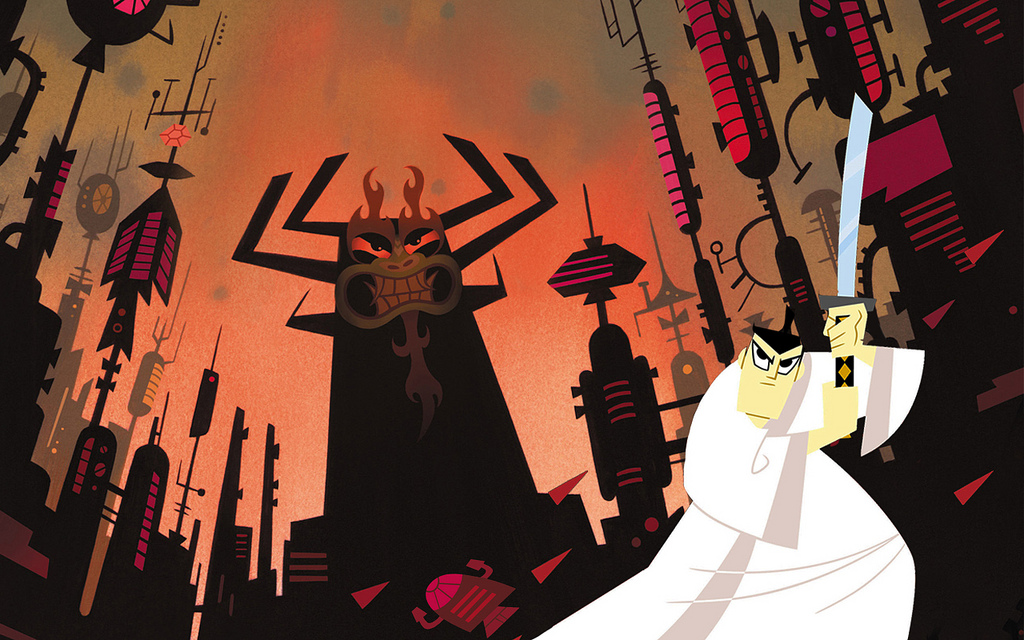
With the second super hero concept finished up we still had the matter of the environments to deal with. After taking the concepts i had made to QA we decided that the most successful iteration by far was the Samurai Jack style.
From that iteration i mixed up the color of the windows after researching cities at night. My favorite one by far was Hong Kong because of its scale and different colors seen from the skyline.
  From that research i iterated more on the city and different aspects of it which could give the frames a sense of atmosphere and immerse the player into the environment.
 I made the foreground buildings with a slight outer glow to separate them from the background this also fakes the glow of the lights of the building and the smog of the city.
The frames looked awesome when we implemented the environment into the frames, the parallax gives it a nice sense of depth and it doesn't take away from the focus of the characters.
So this is it we have done our homework we re defined the art style and I am confident about the presentation on Tuesday we will be keeping our fingers crossed to be able to pass green light and start full blown production.


Tuesday, January 29, 2013

Marvelous Polish and a Light Speed Concept

This week in class we talked about how we could use the environments that i worked on last week to make a more dynamic environment. We thought about playing with the perspective of the backgrounds to make it look like the player is going around the city while keeping it in a 2D plane, this is a very interesting art style called glide perspective sadly there aren't many references and the only good example i have been able to find wasn't very helpful. Another concern we had was that we didn't know how glide perspective would work with the 3D platforms in which the players are fighting on. Speaking of the 3D environments, junior Taber Noble has agreed to help us out with the 3D platforms for the city scape this is a very exciting development as we were all dreading on having to work on 3D environments, Cheers!
So back to the topic, with 3D environment art taken care of we still have to figure out how the 2D backgrounds will work, we decided that we would separate the stage into three comic book panels, each panel will feature a different part of the city and they will be separated by destructible gutters which the characters will be able to punch, kick, and fly through in real time throughout the battle. Possible ideas for the background on each panel would feature different districts which would be represented by class for example the rich districts would be represented with skyscrapers, the middle class could be located around the water and have bridges and docs themes, and the lower class district could be represented with slums and not so tall architecture in the distance.
Sadly concept art for these is not available yet but at least we have a concrete idea of the goal which we want to achieve. You might be asking yourself, Why is there no concept art for these backgrounds? great question! backgrounds are without a doubt an important part of the game and a requirement for green light however in the grand scheme of things the characters are a bigger more important part which undoubtedly will be more time consuming and as such we wanted to get Major Marvelous finalized and a concrete Light-Speed Lass concept ready for her to start being modeled.

Starting with Major marvelous Tristan needed a concrete idea of the parts of the costume/armor to finish up MM, now part of the process of creating characters in the professional world is a back and forth between the concept artist and the 3D artist so what i focused on this week for Major Marvelous was to do a paint over in order to define the forms, and textures of what the costume will look like.

After doing the paint over i decided that there was something odd about him. I figured out that the pants were the reason so i updated them.
I felt like the blue pants unified the costume much better and the team agrees, so after a slight change in the armor and the colors we now have our finished MM concept, HOORRAYY!!!

Last but not least my other focus this week was Light-Speed Lass. First lets recap on the previous concepts

  i took the colors of the most successful option that we had before and updated it with some of the things the team want which include a light armored look, streamline design, segmented costume. Since her suit acts as a space suit as well as her defining super hero costume i wanted to give her a shiny futuristic look.
I tried to give her different pieces on her armored suit to break simetry and keep the design interesting however i wasn't too sure on what to do with her helmet so for now lets disregard the face as i need to consult with the team about what worked best on the earlier concepts and what could work given the new direction.

Sunday, January 20, 2013

Backgrounds for the green Light

This week in class we discussed the requirements that we absolutely need to meet in order to get the green light to start "production" of Crisis of the super verse. One of the main things that we need is to make the game feel like the player is fighting inside a cosmic book, a way in which we want to give the players such feeling is to switch from 3D rendered backgrounds to 2D images with parallaxing effects to simulate depth.
The challenge with this is that out main producer wants us to be able to show at least 3 different art directions in which Environments could be portrayed as 2D.

Personally as an artist I am big into detail, but for the purpose of this game I have to stray away from that because the environments are an asset which we will use to create the feeling of being in a comic book but we don't want them to steal the show from the super-powered action going on within them. For this reason we have decided to take a more simplistic approach. Looking through some TV shows and references of what has work for shows and games before we stumbled upon a classic, Samurai Jack. We enjoyed the simplistic look of the environments because they didn't detract from the characters.


What i really enjoyed from the backgrounds is the black simple shapes that clearly represent buildings. From a comic book perspective these black shapes fit perfectly in my vision for the backgrounds because most comics have that similar look with hard black shadows which i think players will relate to.


 The idea behind these backgrounds is that they will be split into different layers and they will move at different speeds (parallax) to simulate depth. These are just concepts pieces however if we decide to go with this art style then i will add more variation in the buildings for the foreground and the background as well as more lights which will add more atmosphere to this metropolis that we are trying to portray.

Other ideas for different art styles we want to try out are along the lines of the Venture Brothers which use many more colors but they still keep simple shapes and use different blending techniques to make their buildings and props look simple yet easy to read.


Also another art style that i am very excited to try out is along the lines of Spectacular Spider Man, this art style uses simple shapes yet differentiates the buildings by using different colors fort he brick and the windows.


Again the idea is that the backgrounds provide a sense of atmosphere without distracting the player from the action.


Wednesday, January 16, 2013

New Year, New Project, New Game


The year ended, and with it some projects were left behind, others moved on. I was put on a new project, The Crisis of the Super-Verse, a fighting game where super heroes take the center stage and battle it out in different stages corresponding to each one of their stories. The game has solid game mechanics, but the art needs a revamping which is where i come in.
I am a huge comics fan so this is a huge opportunity for me to take the lead artist position and make some awesome art for my portfolio as well as helping make the art be as successful part of the game.
The first changes we talked about was how to turn a fighting game, into a fighting game that takes place inside a comic book. Right off the bat we knew that the backgrounds needed to be changed, as of now they are rendered in 3D space, what we want to do is make the backgrounds 2D so relay the feeling of being inside the comic book.

My first assignment as lead artist was to update the two preexisting characters, Major Marvelous, and Light-Speed Lass.
I want the characters to have a modern look, old school comics have more of a simple design and both Tristan and I agreed that we want to give our characters some visual interest, this would open some creative doors and make the characters more interesting to concept and to model. We turned to the DC New 52 comics in which all of the new super heroes got their costumes revamped. For the major marvelous concepts i looked at characters such as Superman, Batman, Shazzam, the Sentry, and Captain America.


 I really liked how their costumes stayed simple yet the artists used simple shapes to make them look more armor plated. This is an idea that me and Tristan really liked so we adopted it into our Major Marvelous costume.
Out of this four iterations we decided to go with the fourth option. We liked the way the suit was broken up and it looked not only like a super suit but also like a suit of armor. Since the battle will be among super heroes they need the right kind of protection. Once we had decided that we wanted the 4th suit we wanted to go with for Major Marvelous i made a concept art piece out of it so that Tristan could start modelling him and we could get the animations on the way.
I also did some concepts for Light-Speed Lass. She still needs some work but the concepts are based on the Flash, her bio says that her suit also acts as a space suit that is why i made a heavier version. We are thinking about keeping the color scheme of the first suit but again giving it a more segmented and armor plated look.
When the team showed my work to professor Nadel he really liked the idea of going with the New 52 style he said it would work as a satire because he doesn't think that DC's new comics makes sense. I personally don't have a problem with the direction DC has taken but i do like the idea of poking fun at this controversial situation that is taking place in the comic book world.